
A Short Reference About the Author
Mariia is a Dynamics 365 Developer with extensive experience working with Dynamics 365, Power Platform, Power BI, Power Automate, and other powerful Microsoft tools.
Introduction
In our previous article, Dynamics 365 Reporting vs Power BI, we established a framework for choosing the right tool: Native Dashboards for daily operations, SSRS Reports for formal documents, and Power BI for deep analysis.
However, what happens when you find yourself in the middle of the process?
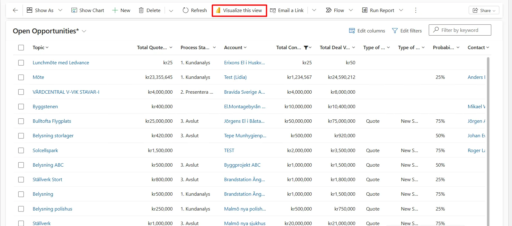
Let us assume you are looking at a list of “Open Opportunities” in Dynamics 365. You do not need a formal report, and you do not have weeks to wait for a data analyst to build a complex Power BI dashboard. You need to understand the data in front of you right now.
This is where the “Visualize this view” feature comes into play. It serves as a powerful bridge between Dynamics 365's static lists and the analytical capabilities of Power BI. And this is what we will closely look at in the article.
What is “Visualize this view”?
“Visualize this view” is an out-of-the-box capability that allows any Dynamics 365 user to generate an interactive Power BI report on the fly, directly from a grid view, without leaving the application.
It does not require you to open a Power BI Desktop, understand complex data models, or write DAX formulas. It takes the data exactly as it is filtered in your current view and uses AI to generate charts that visualize that specific dataset automatically.
How it Works
The process is designed to be intuitive for non-technical users. Here is the typical workflow:
- Navigate to a view: go to any entity grid (e.g., Active Accounts or Closed Cases).
- Apply filters: filter the list as needed (e.g., filter specifically for "High Priority" cases). The visualization will respect these filters.
- Click on the “Visualize this view” located in the command bar (ribbon).
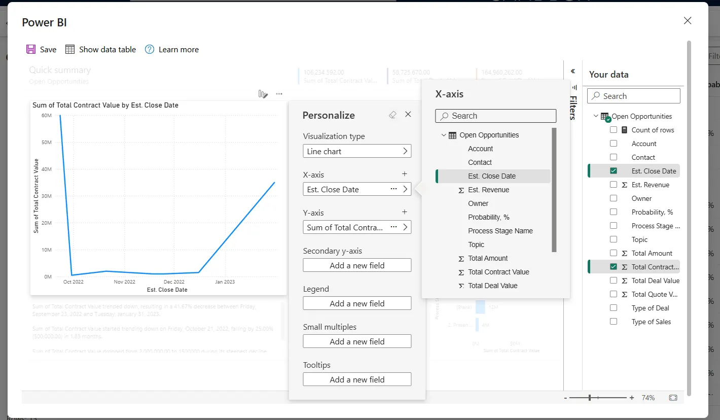
- Observe the instant report: a dialog box opens overlaying your screen. Power BI automatically analyzes the columns in your view and creates a layout of 3–4 relevant charts.

Customizing your Instant Report
The auto-generated report is rarely the final stop. It is fully interactive and customizable, with a simplified “Personalize” pane on the right-hand side of the window.
Change visuals: if the AI chose a bar chart, but you prefer a pie chart, you can switch to a pie chart with one click.
Swap fields: drag and drop fields from your view onto the axes. For example, changing the axis from “Owner” to “Estimated Close Date.”
Aggregations: easily toggle between counting records, summing revenue, or averaging values.
Comparison: Where Does it Fit?
To understand where this feature fits in your toolkit, let us look at its strengths and limitations compared to the standard tools we discussed in the previous article.
| Feature | Visualize this view | Standard Power BI Report |
|---|---|---|
| Speed | Instant (seconds) | Slow (days/weeks of development) |
| Data source | Only the current D365 view | Multiple sources (ERP, Excel, D365) |
| Skill required | None (end-user friendly) | High (developer/analyst skills) |
| Customization | Low (limited to view columns) | Unlimited (DAX, custom visuals) |
| Persistence | Temporary (unless saved) | Permanent |
Common Scenarios
When should a user click on this button?
Ad-hoc data exploration
A sales manager looks at a list of 500 opportunities. Instead of scrolling through pages, they visualize the view to see a breakdown of the “Estimated Revenue by Phase instantly.” They spot a bottleneck in the “Qualify” stage immediately.
Data quality checks
An admin is reviewing "Active Contacts." By visualizing the view by "City," they instantly see a bar chart where half the records have "Blank" as the city. They immediately know that the data quality needs attention without exporting to Excel.
Quick answers during meetings
During a team call, a question comes up: “Who closed the most cases last month?” Instead of saying “I'll get back to you,” the user filters the view to "Resolved Cases Last Month," clicks Visualize, and has the answer in a chart format instantly.
Saving and sharing
By default, these visualizations are temporary. Nevertheless, if you find the view you have created useful, you can save it.
Save: you can save the report to your personal Power BI workspace.
Share: once saved, you can share the link with colleagues (! Note: This typically requires a Power BI Pro license for both the sender and the receiver.)
Conclusion
“Visualize this view” democratizes data analysis in Dynamics 365. It removes the dependency on IT developers for simple questions and empowers every user to become a data analyst.
While it does not replace the need for robust, enterprise-wide Power BI Dashboards, it fills a critical gap for instant, personal, and ad-hoc analysis.