
A Short Reference about the Author
Mariia is a highly experienced Dynamics 365 Developer with unique development skills and deep knowledge of Microsoft products, such as Dynamics 365, Power Automate, Power BI, and others. She has gained her expertise through numerous projects in data management, CRM automation, process customization, and more.
Introduction
Dynamics 365 is a goldmine of data. But accessing that data effectively can be confusing. Out of the box, you are presented with three primary tools for data management: dashboards, reports (SSRS), and Power BI integration.
Choosing the wrong tool for the task leads to frustration. You might spend days trying to make a D365 Dashboard show data from an external system, or struggle to make a Power BI report look like a pixel-perfect sales invoice.
In reality, there is no single “best” tool, as each is best suited to its specific task. This article will compare all three, explain their capabilities, and give you a clear framework for when to use each.
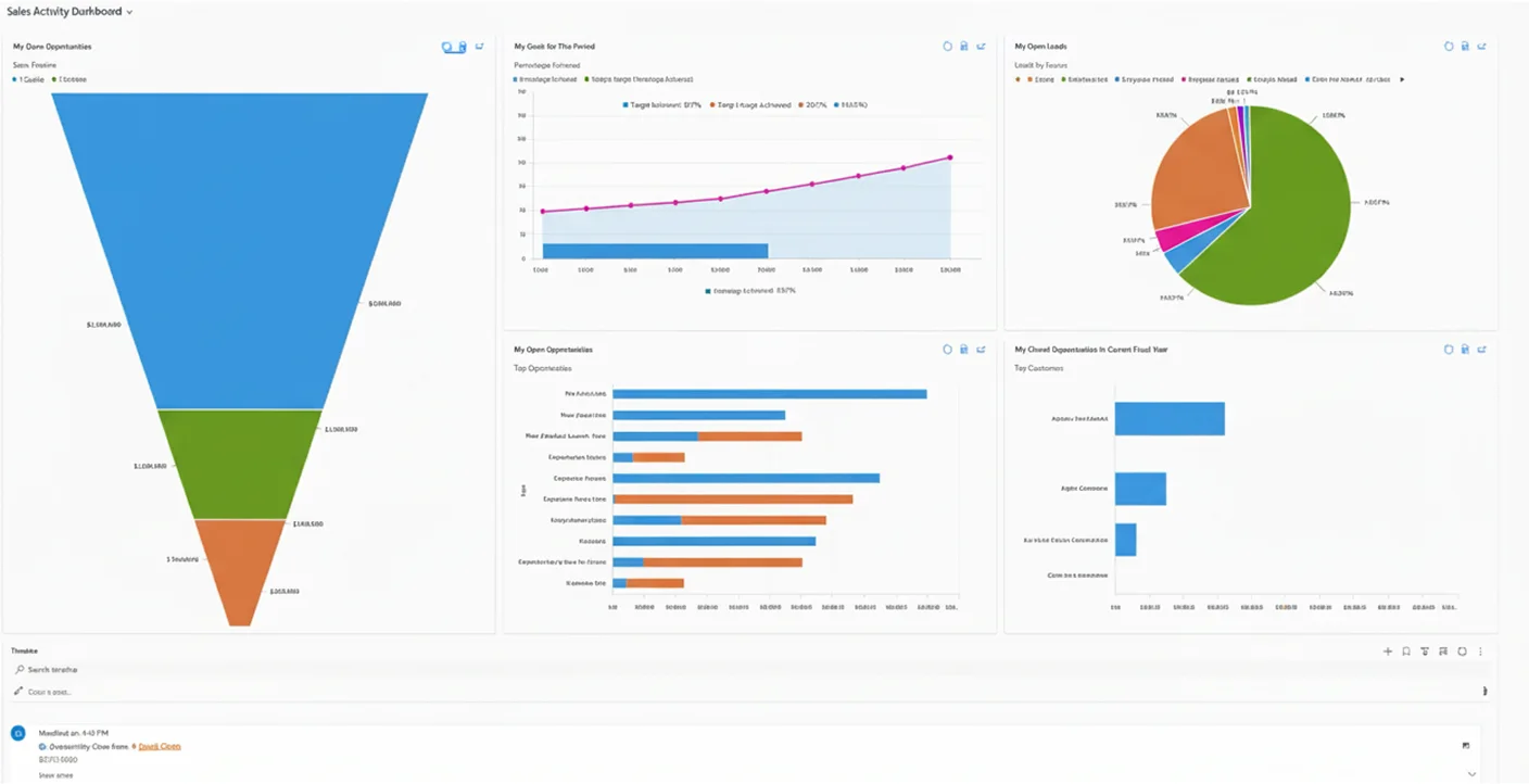
Native D365 Dashboards
A dashboard is the tool users see every day when they log in. It is designed for real-time, operational work.
In fact, dashboards are a collection of charts and lists (views) displayed directly on your D365 home screen or entity pages. They are used for daily monitoring by end-users. Think of it as your "command center."
Common scenarios may look like these:
- A salesperson is checking their "Open Opportunities" and "Activities" for the day.
- A service manager is monitoring a queue of "Active Cases by Priority."
- A user wants to see a simple chart and then clicks on a segment to see the underlying list of records.
| Pros | Cons |
|---|---|
| Real-time. Data is 100% live. Users refresh the page and see the new data. | D365 data only. It cannot combine data from external sources. |
| In-context and interactive. Users can click on a chart segment, and the associated list filters automatically. | Simple visuals. It is limited to basic charts. |
| Easy to create. Any user can create their own personal dashboard in minutes. | Not for analysis. It is bad at showing complex trends, historical snapshots, or advanced calculations. |
| Security-driven. It automatically respects the user's D365 security role. | Not printable. It is designed to be seen on a screen but not exported as a formatted document. |
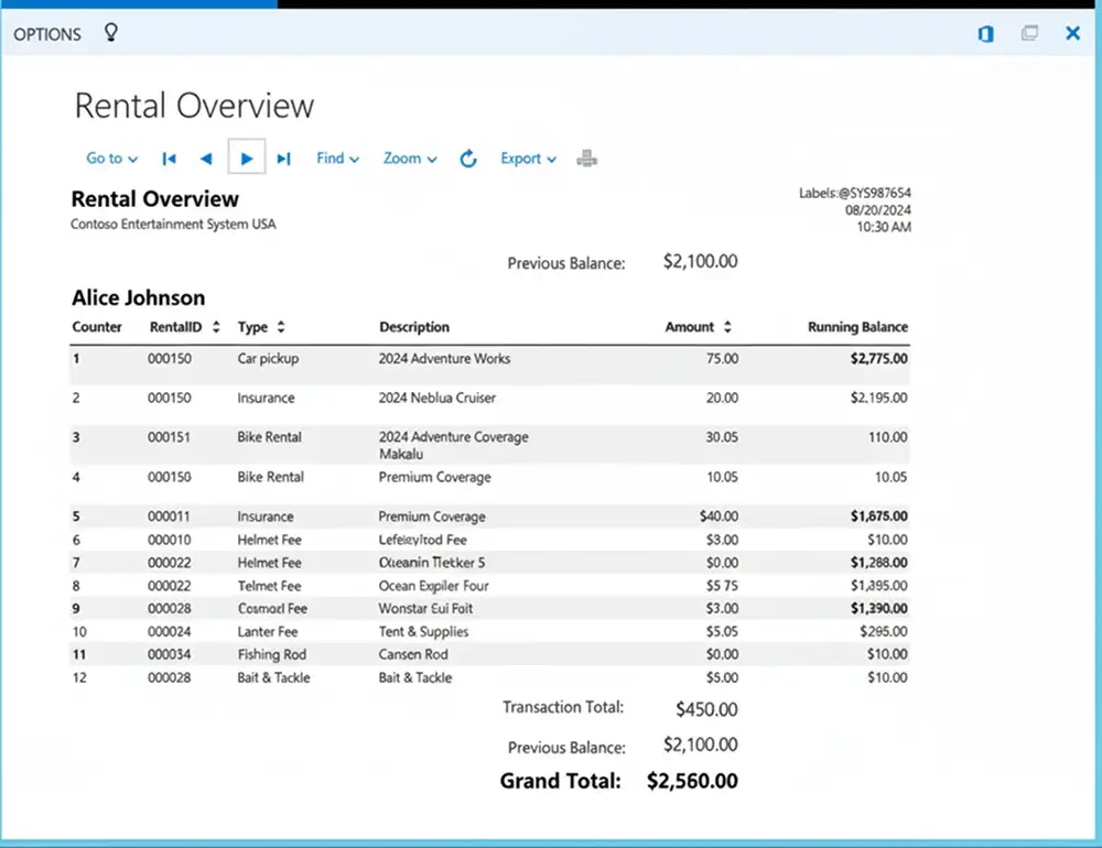
Native D365 Reports
This is the traditional, formal reporting engine of Dynamics 365. Its primary purpose is not analysis, but document generation. Reports are formatted, static documents based on SQL Server Reporting Services (SSRS). You can use them when you need a printable, pixel-perfect document or a precisely formatted list.
Common scenarios include the following:
- Generating a sales Quote or Invoice to send to a client.
- Creating a complex, table-based report with specific groupings and totals (e.g., "All Cases by Account, Grouped by Parent Account").
- Exporting a formatted list to PDF, Word, or Excel.
While the underlying technology (SSRS) is older, Microsoft has significantly improved its experience of using these reports. The modern interface provides a streamlined reporting panel, advanced filtering options, and improved performance, making it more user-friendly than before.
| Pros | Cons |
|---|---|
| Pixel-perfect layout. You have total control over the layout, fonts, headers, and footers. | Hard to build/modify. It requires a developer using Visual Studio or Report Builder. |
| Great for printing/PDF. This is its main strength. | Not interactive. They are static "snapshots." You cannot click on a chart to filter a table. |
| Complex grouping. It can handle complex SQL-based queries, sub-reports, and data grouping. | D365 data only. It cannot easily combine external data sources. |
| Handles large datasets. They are good at exporting large volumes of data into formatted tables. | "Old school" feel. The visual style is not as modern as Power BI. |
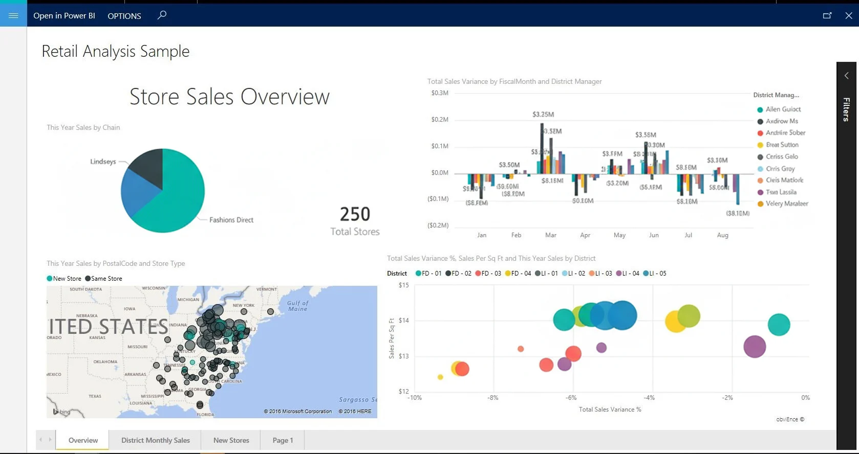
Power BI
This is the premier business intelligence tool. Its job is not just to show data, but to help you understand it, find trends, and gain insights. This external analytics service can connect to any data source, model it, and create stunning, interactive reports. These can then be embedded back into D365. It is used for data analysis, trend spotting, executive-level KPIs, and combining multiple data sources.
Common scenarios look like these:
- An executive dashboard showing D365 Sales data combined with Finance data from an ERP.
- A service manager analyzing trends in "Case Resolution Time" over the last 3 years.
- Complex calculations (using DAX), for instance, "Year-over-Year Growth" or "Customer Lifetime Value."
| Pros | Cons |
|---|---|
| Connects to anything. (It is its biggest strength.) They can merge D365, SharePoint, Excel, SQL Server, etc. | Not real-time. Data is "refreshed" on a schedule. |
| Stunning visuals. It is a massive library of beautiful, modern, and custom visuals. | Separate skill set. It requires knowledge of Power Query and DAX. |
| Highly interactive. Slicers, filters, and cross-highlighting let users "explore" the data. | Licensing. It may involve extra Power BI Pro or Premium license costs. |
| AI insights. It can automatically find trends, key influencers, and anomalies in your data. | "Overkill" for simple tasks. It is too complex to just show a list of open activities. |
Comparison: Which Tool Should You Use?
Here is a simple cheat sheet to help you decide:
| Feature | Dynamics 365 Dashboard | Dynamics 365 Report | Power BI |
|---|---|---|---|
| Primary goal | Daily operations | Formal documents | Deep analysis |
| Data source | D365 only | D365 only | D365 + anything else |
| Data freshness | Real-time | Snapshot | Scheduled refresh |
| Visual style | Simple, basic charts & lists | Static, pixel-perfect tables | Modern, beautiful, interactive |
| Interactivity | High | None | Extremely high |
| Ease of creation | Very easy | Very hard | Medium |
| Best for... | Salesperson, service agent | Admin, operations | Manager, analyst, executive |
Conclusion
There is no "winner" to optimize Dynamics 365 reporting, only the right tool for the right job:
- Use native dashboards in Dynamics 365 for your frontline users. Provide them with the real-time, in-context data they require to do their job right now.
- Use native reports in Dynamics 365 (SSRS) when you need a static, printable, or perfectly formatted document, like an invoice, quote, or formal list.
- Use Power BI when you need to perform real analysis, see long-term trends, or combine your Dynamics 365 data with other business systems to get a 360-degree view for effective data management in Microsoft Dynamics 365.