
Introduction
We discussed creating a build config for our React UI library in the previous article. But today we will create a few components based on the given design system and cover them with tests. Finally, we will deploy our package to Azure Artifacts, making it accessible to the team members. Let's start!
Creation Of a Global Theme
Our first task is to create a global theme that will be consistent across all CRM web resources. Our UX designer has provided the necessary color palette and font styles.

We'll use the createTheme function from the @mui/material package to implement it.
import { createTheme } from '@mui/material';

const theme = createTheme({
  palette: {
    primary: {
      main: '#224060',
    },
    secondary: {
      main: '#0a8dc7',
      light: 'rgba(33, 141, 122, 0.1)',
    },
    info: {
      main: '#fff',
    },
    neutral: {
      main: '#B0B9C5',
      light: '#F0F3F7',
      dark: '#64798F',
    },
    error: {
      main: '#DB0041',
    },
    warning: {
      main: '#DB9200',
    },
  },
  typography: {
    h1: { fontSize: 24 }, h2: { fontSize: 20 },
    h3: { fontSize: 18 }, h4: { fontSize: 16 },
  }
});
Buttons:
It is our design for the buttons. Instead of creating a separate component for them, I suggest we modify the @mui theme, much like we did with colors and text.
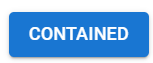
By default, the button from @mui appears as follows:
So, let's customize it.
We have two colors from our color palette (primary, info) and three different sizes (large, medium, and small) that we need to customize.
const theme = createTheme({
 palette: {…},
 typography: {…},
 components: {
  MuiButton: {
      styleOverrides: {
        root: ({ theme }) => ({
          fontSize: '0.875rem',
          lineHeight: 1.15,
          borderRadius: '20px',
          textTransform: 'none',
          '&.Mui-disabled': {
            background: theme.palette.neutral.main,
            color: theme.palette.info.main,
          },
        }),
        containedPrimary: ({ theme }) => ({
          '&:hover': {
            backgroundColor: theme.palette.secondary.main,
          },
          '&.Mui-disabled': {
            background: theme.palette.neutral.main,
            color: theme.palette.info.main,
          },
        }),
        containedInfo: ({ theme }) => ({
          boxShadow: '0px 2px 7px rgba(151, 151, 151, 0.4)',
          сolor: theme.palette.primary.main,
          '&:hover': {
            background: theme.palette.info.main,
            boxShadow: '0px 2px 7px rgba(151, 151, 151, 0.4)',
            color: theme.palette.secondary.main,
          },
          '&.Mui-disabled': {
            background: theme.palette.info.main,
            boxShadow: '0px 2px 7px rgba(151, 151, 151, 0.4)',
            color: theme.palette.neutral.main,
          },
        }),
        sizeLarge: {
          padding: '12px 16px',
        },
        sizeMedium: {
          padding: '8px 16px',
        },
        sizeSmall: {
          padding: '4px 16px',
        },
      },
      defaultProps: {
        size: 'medium',
        variant: 'contained',
      },
    },
 },
});
Let's review our button. You can use your local library version during development with the npm link command (you can read more about it here.) By the way, consider using Storybook to describe and visually display your UI.
import { ThemeProvider, Button, Stack } from '@mui/material';
import { theme, SearchPopover } from '@ui-library';
const App = () => {
return (
<ThemeProvider theme={theme}>
<Stack direction="row" spacing={2}>
<Stack spacing={1.5}>
<Button color="primary" size="small">
Small | Primary
</Button>
<Button color="info" size="small">
Small | Info
</Button>
</Stack>
<Stack spacing={1.5}>
<Button color="primary" size="medium">
Medium | Primary
</Button>
<Button color="info" size="medium">
Medium | Info
</Button>
</Stack>
<Stack spacing={1.5}>
<Button color="primary" size="large">
Large | Primary
</Button>
<Button color="info" size="large">
Large | Info
</Button>
</Stack>
<Stack spacing={1.5}>
<Button disabled color="primary" size="large">
Disabled | Large | Primary
</Button>
<Button disabled color="info" size="large">
Disabled | Large | Info
</Button>
</Stack>
</Stack>
</ThemeProvider>
);
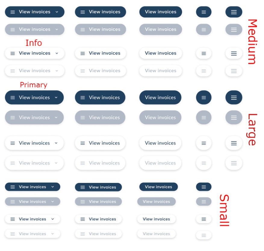
};After running our application, we should see the following UI:
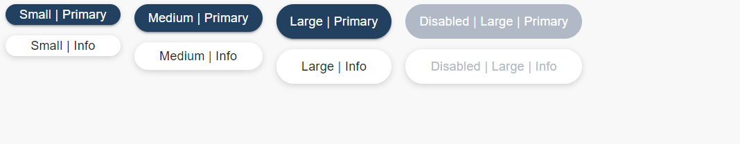
Exactly what we need! Now, we can move on to the next components.
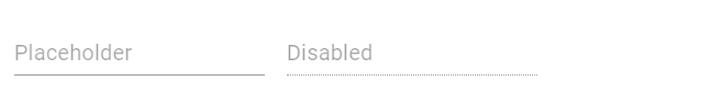
Let's discuss the form elements. In our design system, we have specific text fields. Instead of creating them from scratch, we'll customize the existing Input form element from @mui.
The base input from @mui appears this way, so we'll tailor it to align with our design system.
const theme = createTheme({
components: {
…,
MuiInput: {
styleOverrides: {
root: ({ theme }: { theme: Theme }) => ({
background: '#fff',
border: '1px solid transparent',
borderRadius: 3,
boxSizing: 'border-box',
boxShadow: 'rgba(0, 0, 0, 0.15) 0px 1px 4px inset',
'&.Mui-focused': {
borderColor: theme.palette.secondary.main,
boxShadow: 'none',
},
'&.Mui-disabled': {
background: theme.palette.neutral.light
}
}),
input: ({ theme }: { theme: Theme }) => ({
minHeight: 0,
padding: 0,
paddingLeft: 8,
paddingRight: 8,
fontFamily: 'Proxima Nova',
fontSize: 14,
lineHeight: 1.25,
color: '#000',
'&:focus': {
outline: 0,
},
'&::placeholder': {
color: theme.palette.neutral.dark,
opacity: 1
},
}),
sizeSmall: {
minHeight: 32,
padding: 8,
},
},
defaultProps: {
disableUnderline: true,
size: 'small',
},
},
},
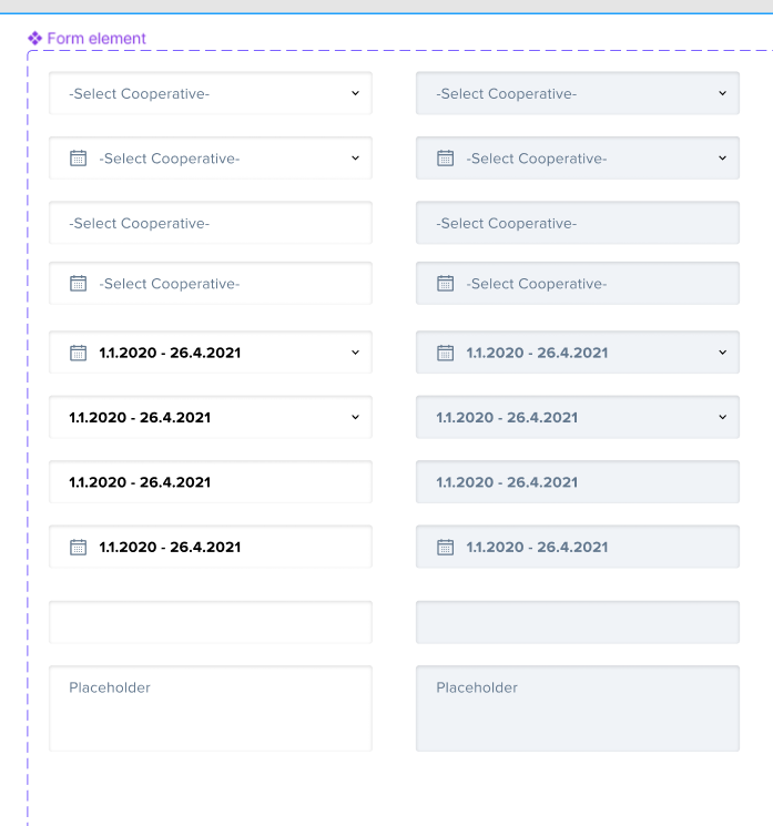
});Now, let's see how it looks:

It looks good. What do you think?
Let's keep moving to the next component. We're going to create a component using the composition pattern and cover it with tests.
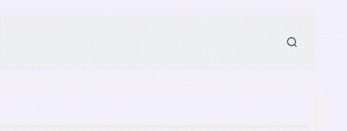
I'm referring to the search component used on every page of our web resources. It has two states: open and closed. When it's in the open state, it appears as a familiar search icon 🔍. When we click on the icon, a search bar appears, attached to the icon, and a close icon replaces the search icon. The open state looks like this:
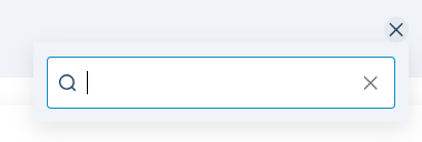
Let’s write code for the component.
At the end, our search component folder structure should look like this:
src
├── SearchPopover
│   ├── SearchInput.tsx
│   ├── SearchInput.test.tsx
    ├── SearchPopover.test.tsx
    ├── SearchPopover.tsx
│   └── index.ts
…
├── index.ts
I will use the TDD approach, so let's start by creating tests for the SearchInput component.
// SearchInput.test.tsx

import React from 'react';
import { render, screen } from '@testing-library/react';
import userEvent from '@testing-library/user-event';

import SearchInput, { SearchInputProps } from './SearchInput';

function renderStatefulSearchInput(props: Partial<SearchInputProps> = {}) {
  function StatefulSearchInput({
    value: inPropValue,
    ...rest
  }: Partial<SearchInputProps>) {
    const [value, setValue] = React.useState(inPropValue ?? '');

    const handleChangeValue = (event: React.ChangeEvent<HTMLInputElement>) => {
      setValue(event.target.value);
    };

    const handleClear = () => {
      setValue('');
    };

    return (
      <SearchInput
        value={value}
        onChange={handleChangeValue}
        onClear={handleClear}
        {...rest}
      />
    );
  }

  return render(<StatefulSearchInput {...props} />);
}

describe('<SearchInput', () => {
  it('Rendering default view should correctly display all elements', () => {
    render(<SearchInput />);

    expect(screen.getByTestId('SearchIcon')).toBeInTheDocument();
    expect(screen.getByRole('textbox')).toBeEnabled();
    expect(
      screen.queryByRole('button', { name: /clear/i })
    ).not.toBeInTheDocument();
  });

  it('Rendering search input without search icon should correctly display elements', () => {
    render(<SearchInput showSearchIcon={false} />);

    expect(screen.queryByTestId('SearchIcon')).not.toBeInTheDocument();
    expect(screen.getByRole('textbox')).toBeEnabled();
  });

  it('User input should be processed correctly in uncontrolled component', async () => {
    const user = userEvent.setup();
    render(<SearchInput />);

    await user.type(screen.getByRole('textbox'), 'Custom input text');
    expect(screen.getByRole('textbox')).toHaveValue('Custom input text');
  });

  it('User input should be processed correctly in controlled component', async () => {
    const user = userEvent.setup();
    renderStatefulSearchInput();

    await user.type(screen.getByRole('textbox'), 'Custom input text');
    expect(screen.getByRole('textbox')).toHaveValue('Custom input text');
  });

  it('Clear button should be vissible when onClear method is passed', () => {
    const mockClearFn = jest.fn();

    render(<SearchInput onClear={mockClearFn} />);

    expect(screen.getByRole('button', { name: /clear/i })).toBeInTheDocument();
    expect(screen.getByRole('button', { name: /clear/i })).toBeEnabled();
  });

  it('After clicking clear button input value should be empty', async () => {
    const user = userEvent.setup();
    renderStatefulSearchInput({
      value: 'test',
    });

    expect(screen.getByRole('textbox')).toHaveValue('test');
    await user.click(screen.getByRole('button', { name: /clear/i }));
    expect(screen.getByRole('textbox')).toHaveValue('');
  });
});
Now, we can create a React component according to the tests.
// SearchInput.tsx

import React from 'react';

import {
  IconButton as MuiIconButton,
  Input as MuiInput,
  InputAdornment as MuiInputAdornment,
  InputProps as MuiInputProps,
  SxProps,
} from '@mui/material';

import type { Theme } from '../styles';
import { CloseIcon, SearchIcon } from '../icons';

export type SearchInputProps = {
  /**
   * If `true` - display search icon
   *
   * @default - false
   */
  showSearchIcon?: boolean;

  /**
   * If function is passed - display clear button
   * Callback fired when the clear button is clicked.
   */
  onClear?: () => void;
} & Omit<MuiInputProps, 'endAdornment' | 'starAdornment' | 'ref'>;

const SearchInput = React.forwardRef<HTMLDivElement, SearchInputProps>(
  function SearchInput(props, ref) {
    const { showSearchIcon = true, onClear, sx, ...rest } = props

    const iconSxProps = React.useRef<SxProps<Theme>>({
      fontSize: '0.75rem',
      color: (theme) => theme.palette.primary.main
    }).current;

    return (
      <MuiInput
        autoFocus
        {...rest}
        ref={ref}
        endAdornment={onClear ? (
          <MuiInputAdornment position="end">
            <MuiIconButton aria-label="clear search query" onClick={onClear}>
              <CloseIcon sx={{ ...iconSxProps, color: 'rgba(0, 0, 0, 0.54)' }} />
            </MuiIconButton>
          </MuiInputAdornment>
        ) : undefined}
        startAdornment={showSearchIcon ? (
          <MuiInputAdornment position="start">
            <SearchIcon sx={iconSxProps} />
          </MuiInputAdornment>
        ) : undefined}

        sx={{
          color: 'transparent',
          minWidth: '250px',
          boxShadow: '0px 1px 4px rgba(0, 0, 0, 0.15)',
          ...sx
        }}
      />
    );
  }
);

export default SearchInput;
After running our tests, we should see the following results:
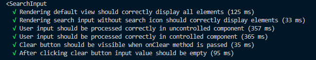
If the results match the screenshot, our tests have passed, and we can proceed.
Next, let's create our SearchPopover component, which displays both our search component and our icon button.
We'll begin with our tests:
// SearchPopover.test.tsx

import React from 'react';
import { render, screen, waitFor } from '@testing-library/react';
import userEvent from '@testing-library/user-event';

import SearchPopover from './SearchPopover';

describe('<SearchPopover />', () => {
  it('Display toggle button & close icon', () => {
    render(<SearchPopover />);

    expect(
      screen.getByRole('button', { name: /toggle search popover state/i })
    ).toBeInTheDocument();
    expect(screen.getByTestId('SearchIcon')).toBeInTheDocument();
  });

  it('Display correct elements when popover is opened', async () => {
    const user = userEvent.setup();
    render(<SearchPopover />);

    await user.click(
      screen.getByRole('button', { name: /toggle search popover state/i })
    );
    await waitFor(() => {
      expect(screen.getByRole('textbox')).toHaveFocus();
    });
    await user.click(
      screen.getByRole('button', { name: /toggle search popover state/i })
    );
    await waitFor(() => {
      expect(screen.queryByRole('textbox')).not.toBeInTheDocument();
    });
  });
});
And our component:
// SearchPopover.tsx
import React from 'react';
import { Box, Fade, IconButton, Popper, SxProps } from '@mui/material';
import { CloseIcon, SearchIcon } from '../icons';
import type { Theme } from '../styles/theme';
import SearchInput, { SearchInputProps } from './SearchInput';
type SearchPopoverProps = {
disabled?: boolean;
sx?: SxProps<Theme>;
SearchInputProps?: SearchInputProps;
};
const SearchPopover = ({ disabled, sx, SearchInputProps }: SearchPopoverProps) => {
const iconSxProps = React.useRef<SxProps<Theme>>({
fontSize: '0.75rem'
}).current;
const [anchorEl, setAnchorEl] = React.useState<HTMLElement | null>(null);
const handleToggle = (event: React.MouseEvent<HTMLButtonElement>) => {
setAnchorEl((prevState) => !!prevState ? null : event.currentTarget);
}
const open = !!anchorEl;
const Icon = open ? CloseIcon : SearchIcon;
const id = open ? 'search-input-popover' : undefined;
return (
<>
<IconButton
aria-describedby={id}
aria-label="toggle search popover state"
disabled={disabled}
onClick={handleToggle}
sx={{
color: (theme) => theme.palette.primary.main,
background: open ? 'rgb(230, 234, 239)' : 'transparent',
...sx
}}
>
<Icon sx={iconSxProps} />
</IconButton>
<Popper
id={id}
open={open}
anchorEl={anchorEl}
placement="bottom-end"
transition
>
{({ TransitionProps }) => (
<Fade {...TransitionProps}>
<Box
sx={{
padding: '10px',
background: 'rgba(240, 243, 247, 1)',
boxShadow: 'rgba(0, 0, 0, 0.1) 0px 5px 15px'
}}
>
<SearchInput {...SearchInputProps} />
</Box>
</Fade>
)}
</Popper>
</>
)
};
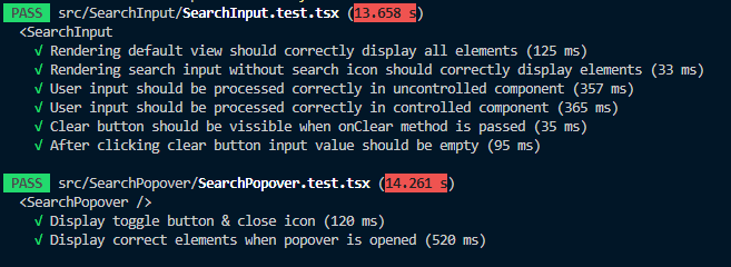
export default SearchPopover;Rerunning our tests, we should get the following results:
Let’s see how it looks visually:
It should give you a good idea of using the @mui library to create custom components when the default ones aren't sufficient.
Deploy to Azure Artifacts
To allow your library to be used by your team members, you'll need to publish it to a location they can access. In this instance, we will be publishing to Azure Artifacts. First, log in to your Azure DevOps account and select the "Artifacts" menu item.
After that, you will see a 'Create Feed' button. Click the button and fill out the form.
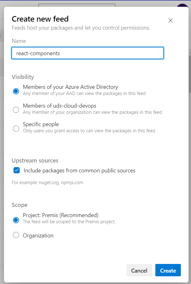
Don't forget to select the “Include packages from common public sources” option. This feed will serve as a source for both public and private packages. When connecting to this feed from consuming applications in the future, this option will enable us to install external dependencies from common public sources, such as npmjs.com.
Connecting to Azure Artifacts Feed
From the Azure Artifacts feed page, we previously created, click the "Connect to feed" button and select "npm" from the available options.

We need to add a '.npmrc' file to our React components library in the same directory that contains the 'package.json' file. It will hold the registry address of the feed. You can copy the necessary information from the project setup section of the feed (as shown in the screenshot above) and paste it into your '.npmrc' file. Additionally, we need to generate a Personal Access Token (PAT), which will be used for authentication. You can generate the token using the following command:
vsts-npm-auth -config .npmrc
If you don't have the vsts-npm-auth package, you can install it globally.
Next, we need to build our React components library and publish it to our registry.
Execute npm build, and it will generate a dist folder that should be published.
Subsequently, you can execute the npm publish command. You should see a success message in the console if everything proceeds without issues. For instance:

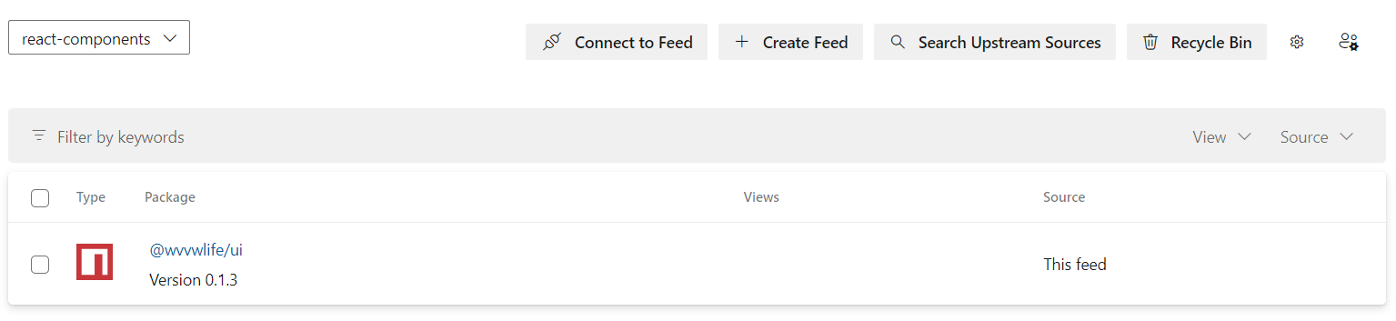
Once uploaded, your package will appear in the created feed. You can then utilize it just like any regular npm package. To use the package, ensure you add a '.npmrc' file with the same addresses to your consumer application.
Conclusion
I hope this article provides a comprehensive guide to creating a private npm library for your team. With clear instructions and best practices, you'll be well-equipped to streamline your team's development process and ensure consistency across projects.
If you've got any questions, we're here to help! Just reach out.